For leadership & strategyrectors · deans · directors
Steer on this year's students, not last year's numbers.
Retention, completion time, and the budget tied to them usually reach your desk as last year's numbers. StudentPulse gives you the same numbers while you can still change them.
The retention numbers you answer for, as leading indicators you can act on while the term is still live.
Illustrative view. The board pack exports exactly this chain.
Trusted by 65+ European institutions
The problem
The squeeze every institution is in
Three pressures, one conclusion: more students must complete, faster, from cohorts that need more help than ever. And your funding model is watching.
Shrinking cohorts
Fewer young people are entering the system. You cannot recruit your way out of attrition; every admitted student has to count.
Rising support needs
Wider-participation intakes arrive less prepared. The cost of getting each student to the finish line grows year on year.
Funding on outcomes
Budgets increasingly follow retention, completion time, and graduate outcomes, and your national quality regime expects a documented response.
The shift
Trade the once-a-year survey for check-ins you can act on
The annual survey lands too late to change anything: by the time the report is written, the students it describes have already gone. StudentPulse replaces it with short, continuous check-ins that are read the moment they arrive and turned into action while the term is still live. Same students, same year, in time to move the outcome.
Swipe for more
01 · Micro check-ins
Students answer, a little and often
A short check-in around three times a semester, roughly a minute on a phone: a few scores and a line in their own words. It feels more like a conversation than a survey, which is why most students answer.
02 · Read and mapped
Every reply, read on arrival
The AI reads each answer the moment it lands and maps it to the shared data model and the four completion factors, by programme, cohort, and campus.
03 · Surfaced in context
The right view for each team
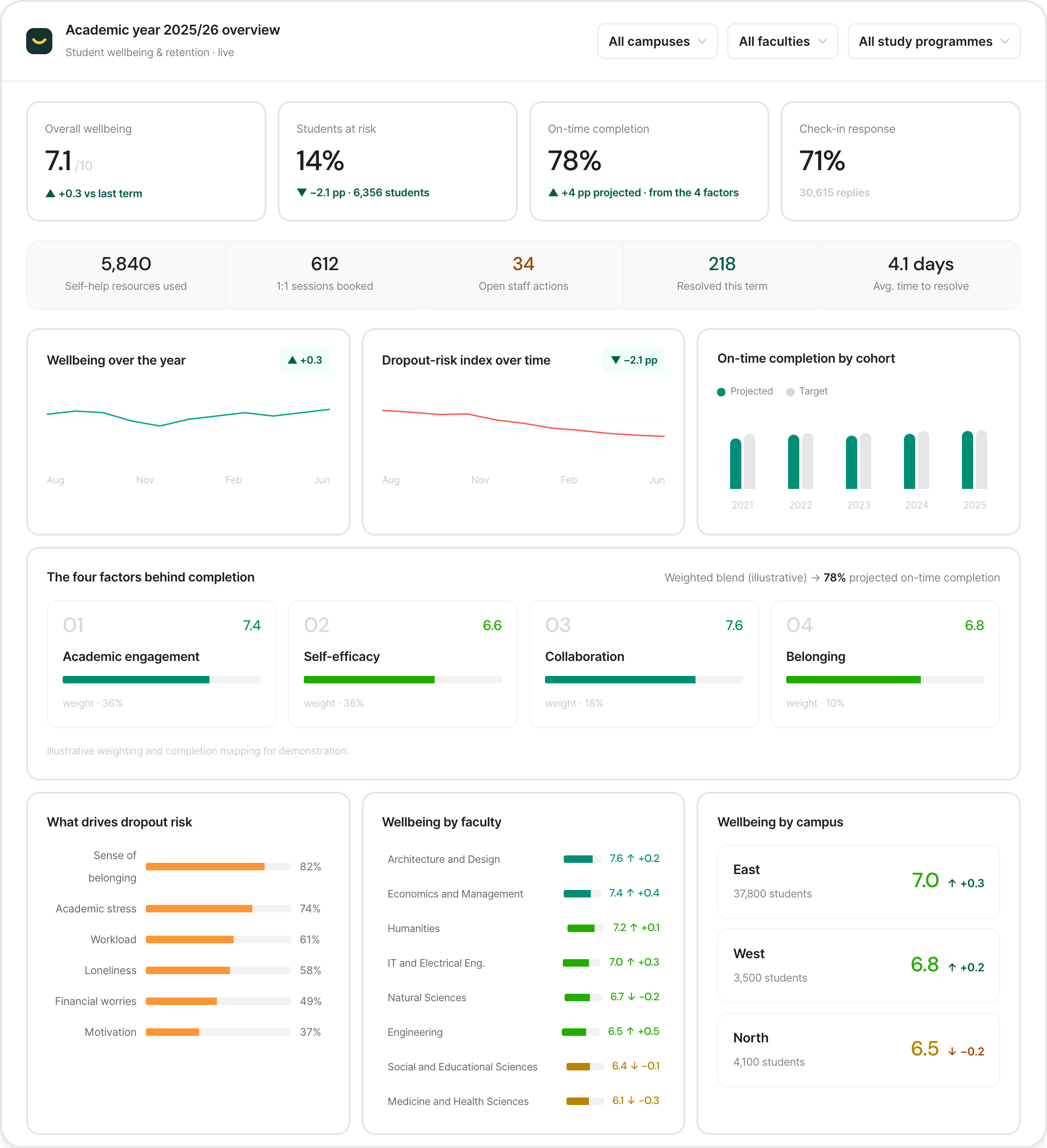
Wellbeing and quality teams act on the signals; leadership sees the same data rolled up to completion and funding. The cockpit below is that leadership view.
Wellbeing, risk, and completion by campus, faculty, and programme, with the open actions next to the numbers they should move. Filter it live.
Academic year 2025/26 overview
Student wellbeing & retention · live
Overall wellbeing
7.1/10
▲ +0.3 vs last term
Students at risk
14%
▼ −2.1 pp · 6,356 students
On-time completion
78%
▲ +4 pp projected · from the 4 factors
Check-in response
71%
30,615 replies
5,840
Self-help resources used
612
1:1 sessions booked
34
Open staff actions
218
Resolved this term
4.1 days
Avg. time to resolve
Wellbeing over the year▲ +0.3
AugNovFebJun
Dropout-risk index over time▼ −2.1 pp
AugNovFebJun
On-time completion by cohort
ProjectedTarget
2021
2022
2023
2024
2025
The four factors behind completionWeighted blend (illustrative) → 78% projected on-time completion
017.4
Academic engagement
weight · 36%
026.6
Self-efficacy
weight · 36%
037.6
Collaboration
weight · 18%
046.8
Belonging
weight · 10%
Illustrative weighting and completion mapping for demonstration.
What drives dropout risk
Sense of belonging
82%
Academic stress
74%
Workload
61%
Loneliness
58%
Financial worries
49%
Motivation
37%
Wellbeing by faculty
Architecture and Design
7.6 ↑ +0.2
Economics and Management
7.4 ↑ +0.4
Humanities
7.2 ↑ +0.1
IT and Electrical Eng.
7.0 ↑ +0.3
Natural Sciences
6.7 ↓ −0.2
Engineering
6.5 ↑ +0.5
Social and Educational Sciences
6.4 ↓ −0.1
Medicine and Health Sciences
6.1 ↓ −0.3
Wellbeing by campus
East37,800 students
7.0↑ +0.3
West3,500 students
6.8↑ +0.2
North4,100 students
6.5↓ −0.2
Live, filterable demo · illustrative data. In the product this is your real institution, down to programme level.
Feature highlight
The few things that need you, found every Monday morning
Every night Observations reads your whole account and brings you the few things that actually need a decision, ranked and written for you. The leadership digest is institution-level risk and where to put resources, framed against your strategy.
1Reads it all, nightly. Every check-in across your account, scores and open comments alike.
2Finds what changed. A programme slipping, a cohort below benchmark, a signal worth a look.
3Ranks and routes. Each finding ranked by urgency and written for you, in-app and a Monday digest.
4Email it on, or act. Send an observation straight to a colleague, or resolve, snooze, or dismiss it yourself.
StudentPulse· Weekly digest1 of 6 · Monday, 08:00
TopicAct now
BSc Computer Science: confidence in achieving academic goals collapsed to 5.3
5.3Now
−3.1
8.4Last year
7.9Own baseline
142 replies
On “I'm confident that I can achieve my academic goals”, BSc Computer Science is at 5.3, down from 8.4 the same period last year, the single largest topic decline at the university. Open comments point to workload and unclear assessment. Recommended next step: a programme review with the department head.
BSc Computer Science
Explore
TopicAct now
“I'm confident that I can achieve my academic goals” is sliding across six programmes at once
5.3Computer Science
−3.1
7.2Law
−1.8
6.9Civil Eng.
−1.5
521 replies
The same topic is down year over year in Computer Science, Law, Civil Engineering, Nutrition, Economics and Psychology, and steeply so in the first three. When one question moves across six programmes at once, treat goal-setting support as an institution-level lever, not six separate fixes.
6 programmes
Explore
TopicFix
“I feel safe on campus” dropped to 7.0 on the west campus
7.0Now
−1.6
8.6Last year
8.7Institution
96 replies
On the west campus, “I feel safe on campus” is at 7.0, down from 8.6 a year ago and below the 8.7 institution average. Several comments mention lighting and evening access. This is a duty-of-care and reputational signal, not a satisfaction one, so it deserves a fast look on its own terms.
West campus
Explore
ActionsFix
213 of 214 surfaced actions are still untriaged, oldest 33 days
0%Completion
214Surfaced
33dOldest
Action queue
The platform has surfaced a full queue of concrete actions and all but one are still waiting to be triaged (the oldest from 7 May, one in progress, none done). The gap is not knowing what to do; nobody has started. This is an accountability gap to own at leadership level.
Action queue
Explore
TopicInvestigate
International students are struggling with financial stress, at 6.0
6.0Now
−1.6
7.6Institution
64 replies
International students score 6.0 on “I can manage the financial stress of tuition, living costs, and debt”, against a 7.6 institution average. The gap is consistent across faculties, so it tracks the student segment rather than any one programme. Worth investigating as a targeted support question.
International students
Explore
TopicPraise
Social Wellbeing is holding at 8.7 across the institution through the assessment period
8.7Now
+0.1
8.6Last year
8.7Institution
6,619 replies
Social Wellbeing sits at 8.7 institution-wide and has stayed steady through the assessment period, when it usually dips. Outside the flagged programmes the base is strong, which is the context for reading the risks above: they are concentrated, not systemic.
Institution-wide
Explore
Advisory by design: Observations flags, ranks and explains. You decide: act on it, email it to a colleague, snooze, or dismiss, with a trail of who resolved what. Illustrative example.
The research
Four factors decide who completes
Independent Danish research from EVA, the Danish Evaluation Institute, names four factors that move completion, grades, and wellbeing: academic engagement, efficacy, collaboration, and belonging. They are not captured by an annual survey. StudentPulse tracks all four continuously, because each maps directly onto the framework it measures with.
Bar length shows each factor's relative effect on completion, from the EVA study.
One shared framework
It all maps to one data model
Behind every check-in sits one research-based framework: three domains, academic, personal, and social, broken into 38 topics and 155 subtopics. The four completion factors, and every number on the cockpit above, are tagged to the same place, so feedback stays comparable across cohorts, faculties, campuses, and the wider sector, and any single factor can be followed as one line over time.
Because every check-in maps to the same framework, each of the four factors reads as one line across the year. You see the dip, the decision you made against it, and whether completion risk actually eased, not a memory of it months later.
Oct signal → timetable and teaching change.First-year engagement dipped in the opening weeks. Reworking the timetable and adding structured contact hours followed early, and engagement climbed for the rest of the year, completion risk easing with it.
Illustrative data · every point maps to the same subtopic in the framework.
Insights across the sector
Your numbers mean more next to everyone else's
Every check-in maps to one shared framework, so your institution benchmarks against comparable ones across the platform, and you see what is already working elsewhere, straight from students. The anonymized dataset makes each institution’s own numbers mean more.
And you are not on your own with it. Your StudentPulse partner helps you read the benchmark, set priorities with your teams, and translate the picture for the board, while the sector view shows which moves actually shifted outcomes elsewhere. Software, plus the people and research behind it.
Aggregate and anonymized. No institution or student is ever identified, and no student IDs are stored.
On the factors StudentPulse measures, students who thrive show up to a 19 percentage point lower dropout risk (EVA, the Danish Evaluation Institute). StudentPulse surfaces those signals in continuous check-ins, early enough to act on them. Retention is the clearest line from the student experience to the institution's results.
A completion outlook by programme, faculty, and campus, the topics driving it, and the interventions in flight. It is the same data model your wellbeing and quality teams work from, aggregated to the level you answer for.
Most leadership dashboards are built from historic data: exam results, completion, absence, and last year’s survey, all after the fact. StudentPulse adds a continuous stream of student feedback that runs during the term, so you see early signals on quality, wellbeing, and engagement while there is still time to adjust, not only when the year is over.
Declining engagement and wellbeing signals surface by programme and cohort in week three, not month nine, and route to the team that can act. It does not replace your financial systems; it sits in front of them, catching the cohorts drifting toward risk before it shows up as absence, failed exams, or dropout, which is what protects both retention and the funding tied to it.
The opposite. StudentPulse collects a large part of your student feedback in one shared platform and turns it into a consistent set of indicators. Quality, wellbeing, and leadership work from the same picture instead of three survey systems, and most institutions retire other questionnaires and ad hoc reports over time.
Yes. StudentPulse can share selected indicators and aggregates with your existing business intelligence setup. Many institutions use the built-in dashboards for operational work and feed a few key indicators into their central leadership or board reports, so StudentPulse becomes a trusted input to the overall picture rather than a separate island.
Yes. StudentPulse supports different views for different roles: senior leadership sees the institution-wide overview, while faculties, schools, and programmes see what is relevant to their area, always above anonymity thresholds. Everyone works from the same underlying data, which makes it easier to align action across levels.
You do not manage check-ins or design questionnaires. Your involvement is in three things: setting direction for what you want to understand, joining regular reviews of the main patterns with quality and wellbeing teams, and using the insight when you decide on programmes, investment, and support. Most leaders fold it into existing meetings rather than adding a new process.
It is not designed to replace mandatory national surveys. It gives you a richer, continuous picture between those points, which many institutions use to explain and interpret national results and to show reviewers how they work with quality and wellbeing throughout the year, not only when a large survey goes out.
StudentPulse often surfaces issues that were present for a long time but never visible in a structured way. The value is that you now know where they are, how large they are, and whether they are improving. You can then decide what needs strategic action, what local teams can handle, and where being honest with students about timing is the right next step.
No. You start from proven journeys and question sets grounded in research, adapted to your context with your Customer Success partner. Leadership mainly needs to be clear on strategic priorities and which indicators matter most for steering; the quality and wellbeing teams shape the detail.
All customer data is stored on servers within the EU, with anonymity thresholds on every aggregate view and role-based access throughout. Identifying students is optional and configured per institution: run it fully anonymous, or connect student identities so follow-up can be personal. The DPA, subprocessor list, and documentation are ready for procurement on the trust page.
Pricing is per institution, based on student volume and setup, not per leader or department, and one license serves the leadership, quality, and wellbeing teams. Public ranges: pilots from €5,000, core from €10,000 per year, enterprise from €35,000. The business case model shows what a one-point retention change is worth against that.
See your institution's numbers, live
A 45 minute demo with your programmes and your funding model on screen.