
The foundation underneath every check-in, summary, and recommendation.
Most platforms sit on top of a survey engine. StudentPulse sits on top of a data model built from three million student responses across hundreds of institutions in 15+ countries. That foundation is what makes everything else work: better questions, sharper summaries, recommendations that fit the institution receiving them.
See it in ActionLong surveys arrive too late to change anything. Response rates fall, so the picture is skewed. Insights stop at a shared inbox or a quarterly report. Students see no result, so they stop participating.
This is not a UX problem. It is a structural one.
For feedback to lead to real improvement, three things have to be true. They apply regardless of the platform you use.
Not at the end of term. Early enough that staff can still act on it.
Quality teams see quality evidence. Wellbeing teams see early signals. Leadership sees a live view they can steer by. Each role sees what is relevant to them, nothing more.
Closing the loop is not a feature. It is the only reason students keep responding.
These three principles only work if the foundation underneath them is right. That foundation is the data model.
Our data model organises every question, response, and action into a shared hierarchy.
Three domains map the territory of student experience: Personal, Social and Academic. Each domain holds around ten topics. Each topic holds a set of subtopics.
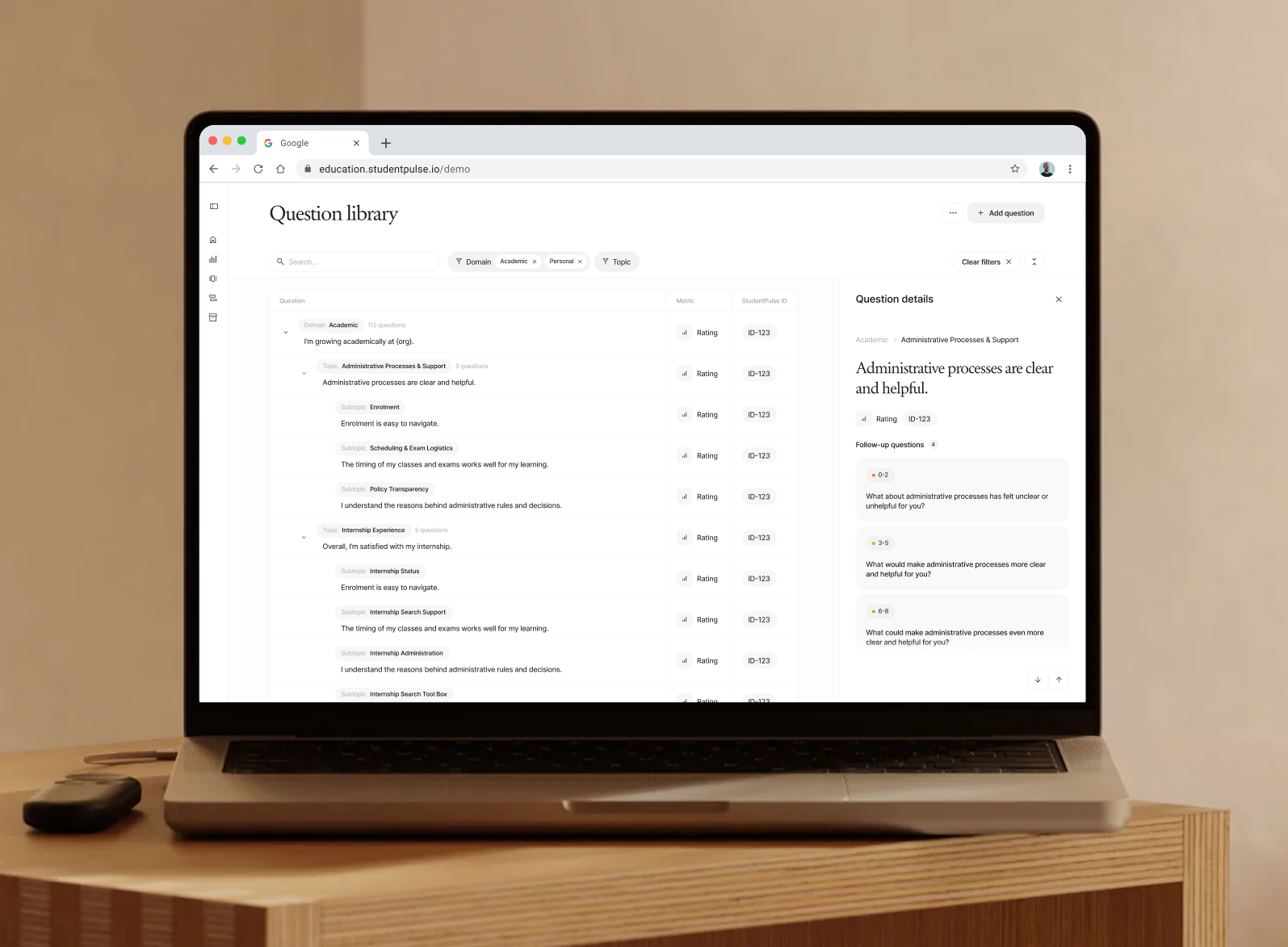
Two institutions can ask the same thing in different words. One asks, “Are the learning goals of this course clear to me?” Another asks, “I know what to do to succeed with this course.” Both feed the same topic. That is what makes the data comparable across the platform, and what makes pattern recognition possible.
The data model is more than a question library. Three things flow into the same
Domain → Topic → Subtopic structure.
Questions drafted in student-friendly language, validated by research, refined across hundreds of institutions. Every question is tagged to a level in the hierarchy.
Scores, sentiment, and free-text comments. Comments are placed into the same topics automatically, so a student writing about workload pressure ends up where workload pressure lives, regardless of which question prompted it.
Self-help resources, one-to-one routing, and the staff actions that follow are all tagged to the same topics. The model tracks which actions students take and which actions are followed by improvement.
That last point is the structural difference. Survey tools can group answers. Generic AI can summarise comments. Our model places questions, responses, and the actions that follow into the same shared structure, then watches what works.
Three million data points across hundreds of institutions in 15+ countries. Single-institution data is too small to see the patterns that matter. Cross-institutional data is what surfaces them.
Generic AI summaries collapse comments into themes that mean something different at every institution. Our model places every comment, score, and action into the same structure, so patterns transfer between institutions instead of dissolving on contact.
When one institution finds an action that improves a topic, that pattern strengthens what we recommend to every other institution working on the same topic. Full anonymity is preserved at every step. No student or institution is identifiable across the network.
Quality, wellbeing, and leadership each see the topics and signals that matter to their role, no matter what survey collected the data.
A teacher opening a report sees what they can act on this week in their classroom. A head of programme sees patterns across courses. A quality lead sees what matters for assurance. The data model knows which topics matter to which role, so the same underlying data is presented differently to each persona. Institutions can adapt the default roles to their own structure.
Themes and priorities grounded in a shared structure, not invented per report.
Every action taken across the platform refines what students and staff are recommended next.
Topics, actions, and outcomes tied together, so quality teams can evidence what changed and why.
Three million data points. Hundreds of institutions. 15+ countries. Five years of refinement.
Validated through research partnerships with Aalborg University and Ontario Tech University. Co-authored peer-reviewed study published March 2026 in Academia Mental Health and Well-Being.
30 minutes is enough to walk through how the data model applies to your institution and your priorities. Book a demo below.

